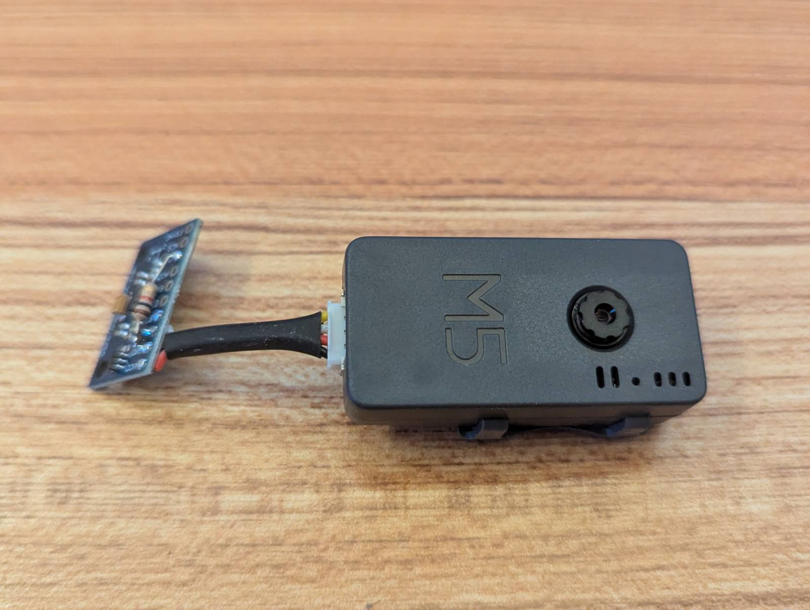
We’re doing some prototyping with the ESP32 based M5 camera. In order to get gyroscopic motion data from our wearable camera we attached a little MPU-9250 board with 9 DoF sensors including gyroscopes, accelerometers and magnetic compass. You can see it attached to the camera here:
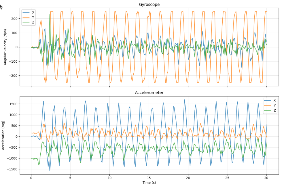
I had CSV files full of gyroscope and accelerometer readings from the MPU-9250. Rows and rows of timestamps and X/Y/Z values. A 2D plot tells a story, showing an exaggerated walking gait:
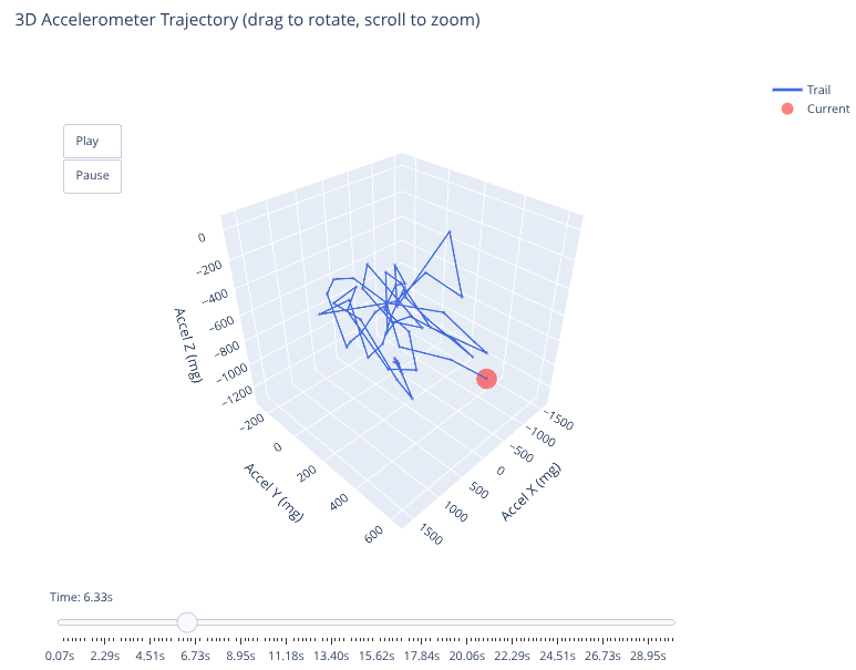
Plotly turned those numbers into an animated 3D trajectory that shows exactly what the sensor experienced. You can see the motion path in 3D space. Scrub through time with a slider. Watch the trail accumulate as the device rotates.
It’s the difference between data and understanding.
The Basic 3D Scatter Plot
Plotly’s 3D scatter plots are surprisingly simple. You give it X, Y, and Z arrays and it renders them in 3D space:
import plotly.graph_objects as go

fig = go.Figure(data=[go.Scatter3d(
    x=df['gyro_x'],
    y=df['gyro_y'],
    z=df['gyro_z'],
    mode='markers',
    marker=dict(size=4, color='blue')
)])

fig.update_layout(
    scene=dict(
        xaxis_title='Gyro X (dps)',
        yaxis_title='Gyro Y (dps)',
        zaxis_title='Gyro Z (dps)'
    ),
    title='Gyroscope Trajectory'
)

fig.show()
This gives you a cloud of points in 3D. You can drag to rotate, scroll to zoom, and hover to see values. Already way better than staring at CSV rows.
But static plots don’t show how the motion evolved over time. That’s where animation comes in.
Adding Animation Frames
Plotly’s animation system is based on frames. Each frame is a snapshot of the plot at a specific time. You can step through frames manually or play them as an animation:
# Create one frame per timestamp
frames = []
for i in range(len(df)):
    frames.append(go.Frame(
        data=[go.Scatter3d(
            x=df['gyro_x'][:i+1],
            y=df['gyro_y'][:i+1],
            z=df['gyro_z'][:i+1],
            mode='lines+markers',
            line=dict(color='green', width=2),
            marker=dict(
                size=[4] * i + [8],  # Larger marker for current point
                color=['green'] * i + ['red']
            )
        )],
        name=str(i)
    ))

fig = go.Figure(
    data=frames[0].data,
    frames=frames
)
The trick is each frame contains all the data up to that point in time. Frame 0 has 1 point. Frame 100 has 101 points. This creates the “trail” effect where the line grows as time progresses.
The current point gets a larger size (8 instead of 4) and a different color (red instead of green) so you can see where you are in the timeline.
Adding Playback Controls
Plotly has built-in playback controls if you configure the layout correctly:
fig.update_layout(
    updatemenus=[{
        'type': 'buttons',
        'showactive': False,
        'buttons': [
            {
                'label': 'Play',
                'method': 'animate',
                'args': [None, {
                    'frame': {'duration': 50, 'redraw': True},
                    'fromcurrent': True
                }]
            },
            {
                'label': 'Pause',
                'method': 'animate',
                'args': [[None], {
                    'frame': {'duration': 0, 'redraw': False},
                    'mode': 'immediate'
                }]
            }
        ]
    }],
    sliders=[{
        'active': 0,
        'steps': [
            {
                'args': [[f.name], {
                    'frame': {'duration': 0, 'redraw': True},
                    'mode': 'immediate'
                }],
                'label': str(i),
                'method': 'animate'
            }
            for i, f in enumerate(frames)
        ]
    }]
)
This adds Play/Pause buttons and a scrubber slider. The duration: 50 means each frame shows for 50ms during playback. Adjust this to control animation speed.
The slider lets you jump to any point in time. Drag the slider and the plot instantly updates to show the trajectory up to that moment.
Two Plots: Accelerometer and Gyroscope
I made separate visualizations for accelerometer and gyroscope data because they have different scales and meanings:
Accelerometer (measured in milli-g):
- Shows linear acceleration
- Gravity is visible as a constant ~1000mg offset
- Movement shows up as deviations from the gravity vector
Gyroscope (measured in degrees per second):
- Shows rotational velocity
- A stationary device reads ~0 dps on all axes
- Rotation shows up as spikes when the device turns
The code is nearly identical for both, just different column names:
# Accelerometer
fig_accel = create_3d_animation(
    df,
    x_col='accel_x',
    y_col='accel_y',
    z_col='accel_z',
    title='Accelerometer Trajectory',
    axis_label='Acceleration (mg)',
    line_color='blue'
)

# Gyroscope
fig_gyro = create_3d_animation(
    df,
    x_col='gyro_x',
    y_col='gyro_y',
    z_col='gyro_z',
    title='Gyroscope Trajectory',
    axis_label='Rotation (dps)',
    line_color='green'
)
I wrapped the animation creation in a function to avoid duplicating the frame logic.
Performance Considerations
With 1000+ data points, creating a frame for every single point makes the animation sluggish. The page takes forever to load and the slider is unresponsive.
I fixed this by downsampling:
# Only create frames for every Nth point
frame_step = max(1, len(df) // 200)  # Target ~200 frames

frames = []
for i in range(0, len(df), frame_step):
    # ... create frame
This gives you smooth animation with a responsive slider even on large datasets. 200 frames is enough to show the motion clearly without bogging down the browser.
Jupyter Integration
Plotly works beautifully in Jupyter notebooks. The plots are interactive right in the notebook. You can rotate, zoom, and play the animation without leaving the page.
# In a Jupyter cell
fig.show()
For sharing, you can export to HTML:
fig.write_html('gyroscope_animation.html')
The HTML file is standalone. Anyone can open it in a browser and interact with the visualization. No Python, no Jupyter, no dependencies.
What I Learned From the Visualizations
Seeing the data in 3D revealed patterns I wouldn’t have noticed in CSV form:
- The gyroscope shows a consistent -6 dps bias on the X axis when stationary (needs calibration)
- The accelerometer magnitude is consistently ~1000mg when the device is still (correct, that’s gravity)
- During motion, the gyro spikes correspond to physical rotations I made while testing
- The trajectory forms loops when I rotated the device back to the starting orientation
The animation makes it obvious when I picked up the device (gyro goes wild), when I set it down (accel settles to a constant vector), and when it was just sitting there (both sensors mostly flat).
I could have computed these statistics from the raw data, but I wouldn’t have understood them without the visualization.
The Code
The full implementation is in a Jupyter notebook in the project repo. It’s about 100 lines of Python including both visualizations, data loading, and downsampling logic.
If you’re working with any kind of motion sensor data, Plotly’s 3D animations are worth the hour it takes to set up. The interactivity makes debugging sensor issues so much easier than staring at logs.